FACE 1: STATISTICIANS! What do statisticians do? The world is becoming quantitative --that means that knowing and understanding the numbers that explain something is very important. More and more professions, from the everyday to the exotic, depend on data and numerical reasoning. In order to do better, to make discoveries, to make money, to invent new things --they must understand the numbers that go with what they do. Data are not just numbers, but numbers that carry information about a specific setting and need to be interpreted or understood in that setting. With the growth in the use of data comes a growing demand for the services of statisticians, who are experts in the following:
Producing trustworthy data about the numbers
Analyzing data to make their meaning clear
Drawing practical conclusions from data that help make wise decision and show directions for the future.
The next two weeks we will look at how statisticians help you and I make clearer meaning of our world. Do you like numbers? You can major in statistics when you go to college! You are certain to get a great job... Why are statisticians creative? They use their creative thinking skills to see patterns in numbers that most simply do not see!
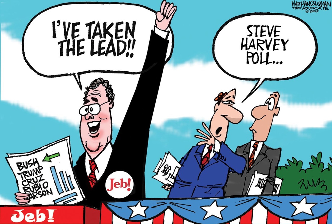
FACE 2: STATISTICS ABOUT POLLS Polls are a tool that generates excitement during elections. There are major businesses such as Gallup that keep track of people's opinions of the candidates during the election. Pollsters get their information by telephoning hundreds of "likely voters" and asking them what they think about the candidates. Generally speaking, the more people who are asked a question, the more likely it is that the results are accurate. The "margin of error" is how far off the poll takers think the results might be from reality. It may be given as a number such as 2%. That means that the real numbers may be 2% higher or lower for a candidate if the poll says it has a 2% margin of error. Candidates determine how well their campaigns are doing in a state based on the results of polls. The results of polls have a lot to do with how the questions are worded. For instance, "Would you vote for Mr. Smith?" or "Would you vote for Mr. Smith even though some say he doesn't pay his taxes?" Sometimes pollster questions are worded to get you to say what they want you to say.
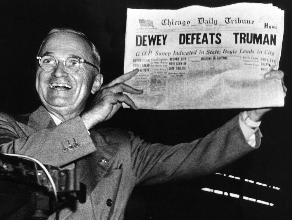
There are, however, polls that are honest and use a good sample of our population to see what people are thinking. Statisticians that the numbers are use them to help us AND those running for political office, who will probably win an election. Sometimes poll results encourage individuals to decide to vote FOR a candidate because they want to be on a winning team. And sometimes they encourage others to vote for the underdog, just because they are the underdog. Usually, the polls are a pretty accurate picture of how an election will turn out... usually. However, polls a long time ago the polls predicted that Dewey would defeat Truman in the race for President. The Chicago newspaper went ahead and printed the headline and article before the election results were tabulated. Ooooooops! The polls were wrong and Truman won. The statisticians would be the first to remind us that, since we are human, we often change our minds at the last minute.
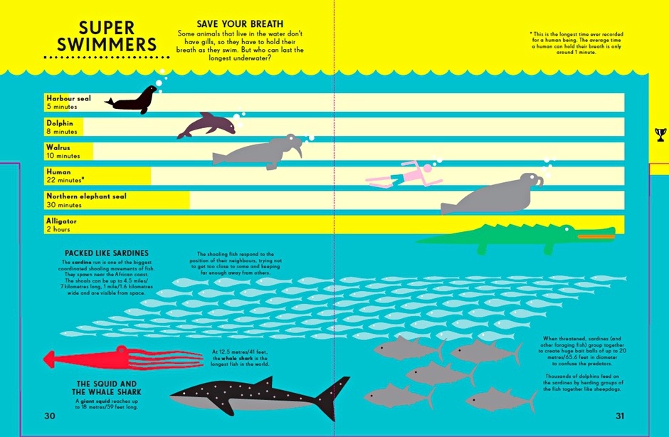
FACE 3: Infographics What is an infographic? A well-designed infographic can help you simplify a complicated subject or turn an otherwise boring subject into a captivating experience. Ideally, an infographic should be visually engaging, contain a subject matter that is appealing to your target audience, and help those looking at the infographic to make sense of information and numbers. Statisticians and others wishing to share ideas and knowledge quickly discover that their findings are much more likely to be understand by using infographics. Let's look at a few designed especially for kids... by the way, infographics are the perfect venue to show your creativity by how you decide to show the data.
FACE 4: VIDEO INFOGRAPHICS This is pretty much self explanatory. A Video Infographic is explained using video. We are wired to like video. Video infographics are simple, yet organize information in a way that is easy for us to understand. Some video infographics are like watching a movie; others are more like charts with moving parts. Creativity loves watching and creating video infographics!
GO HERE TO SEE GREAT EXAMPLES OF VIDEO INFOGRAPHICS!
FACE 5: Professor Hans Rosling Professor Hans Rosling's eye-opening, mind-expanding and funny online lectures have made him an international internet legend.
Rosling is a man who loves the nerdiness of statistics, and in the video below, he entertainingly explores their history, how they work mathematically and how they can be used in today's computer age to see the world as it really is, not just as we imagine it to be.
Rosling's lectures use huge quantities of public data to reveal the story of the world's past, present and future development. Now he tells the story of the world in 200 countries over 200 years using 120,000 numbers - in just four minutes. "The Joy Of Stats - BBC Four". BBC. N.p., 2010. Web. 27 Apr. 2016.